Intro
This style guide is intended as a reference for content managers and developers to properly implement the styles, structures and methodlogy employed in the construction of the APA website.
Components
These are the basic building blocks of your site
This category contains elements that are structured with standard HTML tags and also base abstractions such as grids, icons, etc.
Modules
These are the more complex structures w/ accompanying functionality built for your site.
This category contains elements composed of groups of components and/or custom structures that fuhnction together as a unit.
Palette
Brand Colors
- #1e376d
- #2e5797
- #2c6fb6
- #e05929
- #09839B
- #692e44
- #00667f
- #245e38
- #4d9d44
RGBY
- Red
#e31836 - Green
#42be2a - Blue
#0080f6 - Yellow
#f9b106
Monochrome
- Grey Lightest
#f7f7f7 - Grey Lighter
#ebebeb - Grey Light
#ccc - Grey
#959595 - Grey Dark
#464646 - Grey Darker
#252525
Headings & Paragraphs
With Consideration of ADA: follow a cohesive outline with your content, since keyboard and screen readers navigate by heading elements. Avoid skipping heading levels by setting appropriate hierarchy structure (H1, H2, H3, H4 etc.) Header numbering must always be sequential.
Consider overall page header numbering when editing header tags within code snippets.
Heading 1 - Roboto 38px #111111
<h1>Heading 1</h1>Heading 2 - Roboto 26px #111111
<h2>Heading 2</h2>Heading 3 - Roboto 24px #111111
<h3>Heading 3</h3>Heading 4 - Roboto 22px #111111
<h4>Heading 4</h4>Heading 5 - Roboto 20px #111111
<h5>Heading 5</h5>Heading 6 - Roboto 18px #111111
<h6>Heading 6</h6>Roboto 16px #363636 - Lorem ipsum dolor sit amet, consectetur adipiscing elit, sed do eiusmod tempor incididunt ut labore et dolore linked text magna aliqua. Ut enim ad minim veniam, quis nostrud exercitation ullamco laboris nisi ut aliquip ex ea commodo consequat.
Duis aute irure dolor in reprehenderit in voluptate velit esse cillum dolore eu fugiat nulla pariatur. Excepteur sint occaecat cupidatat non proident, sunt in culpa qui officia deserunt mollit anim id est laborum.
<p>...</p>Lists
- Item one
- Item two
- Item three
<ul>
<li>Item one<li>
<li>Item two<li>
<li>Item three<li>
</ul>- Item one
- Item two
- Item three
<ul class="list--unstyled">
<li>Item one<li>
<li>Item two<li>
<li>Item three<li>
</ul>- Item one
- Item two
- Item three
<ul class="list--block">
<li>Item one<li>
<li>Item two<li>
<li>Item three<li>
</ul>- Item one
- Item two
- Item three
<ol>
<li>Item one<li>
<li>Item two<li>
<li>Item three<li>
</ol>- Item one
- Item two
- Item three
<ul class="list--horizontal">
<li>Item one<li>
<li>Item two<li>
<li>Item three<li>
</ul>- Item one
- Item two
- Item three
<ul class="list--horizontal list--separated">
<li>Item one<li>
<li>Item two<li>
<li>Item three<li>
</ul>General use as supplementary info about events, articles, etc.
- Johnson-Smith Events Center
- Mon, Jan 26 - Wed, Dec 28
- 8am - 2pm
<ul class="list--info">
<li><i class="icon-location" aria-hidden="true">Johnson-Smith Events Center</li>
<li><i class="icon-calendar" aria-hidden="true">Mon, Jan 26 - Wed, Dec 28</li>
<li><i class="icon-clock" aria-hidden="true">8am - 2pm</li>
</ul>- Item one
- Item one info
- Item two
- Item two info
- Item three
- Item three info
<dl>
<dt>Item one<dt>
<dd>Item one info<dd>
<dt>Item two<dt>
<dd>Item two info<dd>
<dt>Item three<dt>
<dd>Item three info<dd>
</dl>
Loader
<!-- Can be a div or span -->
<div class="loader"></div>Updating...
<p><span class="loader loader--sm"></span>Updating...</p>Horizontal Rule
<hr /><hr class="rule--dotted" /><hr class="rule--dashed" /><hr class="rule--ornament" />Buttons
There are multiple styles of buttons used on the site with specific uses listed below.
To use, just assign button classes to a text link or input types "button" and "submit".
<a href="" class="btn btn--primary">...</a>
<input name="" type="button" value="input" class="btn btn--primary"><a href="" class="btn btn--secondary">...</a>
<input name="" type="button" value="input" class="btn btn--secondary"><a href="" class="btn btn--negative">...</a>
<input name="" type="button" value="input" class="btn btn--negative"><a href="" class="btn">...</a>
<input name="" type="button" value="input"><a href="" class="btn btn--white">...</a>
<input name="" type="button" value="input" class="btn btn--white"><a href="" class="btn btn--XSm">...</a>
<input name="" type="button" value="input" class="btn btn--XSm"><a href="" class="btn btn--sm">...</a>
<input name="" type="button" value="input" class="btn btn--sm"><a href="" class="btn btn--lg">...</a>
<input name="" type="button" value="input" class="btn btn--lg">
<a href="" class="btn btn--full">...</a>
<input name="" type="button" value="input" class="btn btn--full">Heading 1 Natural
<h1>Heading 1 <a href="" class="btn btn--natural">...</a></h1>Locked Content
- Add to short text blurbs indicating content requires login/registration
- Use along with islet or island for messaging
Sed ut perspiciatis unde omnis iste natus error sit voluptatem accusantium doloremque laudantium, totam rem aperiam, eaque ipsa quae ab illo inventore veritatis et quasi architecto beatae vitae dicta sunt explicabo.
Nemo enim ipsam voluptatem quia voluptas sit aspernatur aut odit aut fugit, sed quia consequuntur magni dolores eos qui ratione voluptatem sequi nesciunt. Neque porro quisquam est, qui dolorem ipsum quia dolor sit amet, consectetur, adipisci velit, sed quia non numquam eius modi tempora incidunt ut labore et dolore magnam.
<div class="locked">
<p>Sed ut perspiciatis unde omnis iste natus...</p>
</div>
<div class="islet islet--grey h-softEnds h-textCenter">
<p>To continue reading, please <a href="">Sign In</a> or <a href="">Join</a>
</p>
</div>
"More" Link
Add to short text blurbs leading to further reading.
With Consideration of ADA: Text must be more descriptive; using only "more" is considered suspicious text by screen readers as it does not set specific expectations as to what users are clicking. Consider directly linking conversation text in paragraphs or being more descriptive with text (ex: View Events or Full Blog Post)
Lorem ipsum dolor sit amet, consectetur adipiscing elit, sed do eiusmod tempor incididunt ut labore et dolore magna aliqua. Ut enim ad minim veniam, quis nostrud exercitation ullamco laboris nisi ut aliquip ex ea commodo consequat. More on Subject
<p>Lorem ipsum dolor sit amet, consectetur adipiscing elit, sed do eiusmod tempor incididunt ut labore et dolore magna aliqua. Ut enim ad minim veniam, quis nostrud exercitation ullamco laboris nisi ut aliquip ex ea commodo consequat.
<a href="" class="more">More on Subject</a>
</p>
Quotes
Inline quotes
Sed ut perspiciatis unde omnis iste natus error
sit voluptatem accusantium doloremque laudantium, totam rem aperiam.
<p>Sed ut perspiciatis unde
<q>omnis iste natus error</q>
sit voluptatem accusantium doloremque laudantium, totam rem aperiam.</p>
Blockquotes
There are only two mistakes one can make along the road to truth; not going all the way, and not starting.
Buddha
<blockquote>
<p>There are only two mistakes one can make along the road to truth; not going all the way, and not starting.</p>
<cite>Buddha</cite>
</blockquote>There are only two mistakes one can make along the road to truth; not going all the way, and not starting.
Buddha
Sed ut perspiciatis unde omnis iste natus error sit voluptatem accusantium doloremque laudantium, totam rem aperiam, eaque ipsa quae ab illo inventore veritatis et quasi architecto beatae vitae dicta sunt explicabo. Nemo enim ipsam voluptatem quia voluptas sit aspernatur aut odit aut fugit, sed quia consequuntur magni dolores eos qui ratione voluptatem sequi nesciunt.
<blockquote class="blockquote--left">
<p>There are only two mistakes one can make along the road to truth; not going all the way, and not starting.</p>
<cite>Buddha</cite>
</blockquote>
<p>Sed ut perspiciatis...</p>There are only two mistakes one can make along the road to truth; not going all the way, and not starting.
Buddha
Sed ut perspiciatis unde omnis iste natus error sit voluptatem accusantium doloremque laudantium, totam rem aperiam, eaque ipsa quae ab illo inventore veritatis et quasi architecto beatae vitae dicta sunt explicabo. Nemo enim ipsam voluptatem quia voluptas sit aspernatur aut odit aut fugit, sed quia consequuntur magni dolores eos qui ratione voluptatem sequi nesciunt.
<blockquote class="blockquote--right">
<p>There are only two mistakes one can make along the road to truth; not going all the way, and not starting.</p>
<cite>Buddha</cite>
</blockquote>
<p>Sed ut perspiciatis...</p>
Slab
Adds left border and padding to highlight content
Content here...
<div class="slab">
<p>Content here...</p>
</div>
Asides
<aside>
Lorem ipsum dolor...
</aside>Sed ut perspiciatis unde omnis iste natus error sit voluptatem accusantium doloremque laudantium, totam rem aperiam, eaque ipsa quae ab illo inventore veritatis et quasi architecto beatae vitae dicta sunt explicabo. Nemo enim ipsam voluptatem quia voluptas sit aspernatur aut odit aut fugit, sed quia consequuntur magni dolores eos qui ratione voluptatem sequi nesciunt.
<aside class="aside--left">
Lorem ipsum dolor...
</aside>
<p>Sed ut perspiciatis...</p>Sed ut perspiciatis unde omnis iste natus error sit voluptatem accusantium doloremque laudantium, totam rem aperiam, eaque ipsa quae ab illo inventore veritatis et quasi architecto beatae vitae dicta sunt explicabo. Nemo enim ipsam voluptatem quia voluptas sit aspernatur aut odit aut fugit, sed quia consequuntur magni dolores eos qui ratione voluptatem sequi nesciunt.
<aside class="aside--right">
Lorem ipsum dolor...
</aside>
<p>Sed ut perspiciatis...</p>
Tables
With consideration of ADA:When using tables, ensure the correct column and row headers are identified with appropriate tags (such as < th> for table headers).
- Tables should be placed within a div with the class of "tableContainer" applied for responsive sizing and format. By default, tables which are horizontally wider than the viewport on smaller devices will scroll horizontally.
- Classes of "table--striped", "table--bordered" and "table--data" can be added to tables for visual enhancement and usability. It is recommended that you utilize these styles as tables should only be used on the site for tabular data.
- Pixel widths should never be applied to tables as this may break the responsive layout of the page.
| Foo | Bar | ||
|---|---|---|---|
| Lorem | Ipsum | Dolor | Sit |
| Sit | Dolor | 03.788 | Lorem |
| Dolor | 32.210 | Lorem | |
| Dolor | 47.797 | Lorem | |
| Sit | Dolor | 09.640 | Lorem |
| Dolor | 12.117 | Lorem | |
<div class="tableContainer">
<table class="table--bordered  table--striped  table--data">
<colgroup>
<col class=t10>
<col class=t10>
<col class=t10>
<col>
</colgroup>
<thead>
<tr>
<th colspan=3>Foo</th>
<th>Bar</th>
</tr>
<tr>
<th>Lorem</th>
<th>Ipsum</th>
<th class=numerical>Dolor</th>
<th>Sit</th>
</tr>
</thead>
<tbody>
<tr>
<th rowspan=3>Sit</th>
<td>Dolor</td>
<td class=numerical>03.788</td>
<td>Lorem</td>
</tr>
<tr>
<td>Dolor</td>
<td class=numerical>32.210</td>
<td>Lorem</td>
</tr>
<tr>
<td>Dolor</td>
<td class=numerical>47.797</td>
<td>Lorem</td>
</tr>
<tr>
<th rowspan=2>Sit</th>
<td>Dolor</td>
<td class=numerical>09.640</td>
<td>Lorem</td>
</tr>
<tr>
<td>Dolor</td>
<td class=numerical>12.117</td>
<td>Lorem</td>
</tr>
</tbody>
</table>
</div>
Bug
.bug needs to be in a relatively positioned container like an alert.
Messages 13
<p class="alert"><span class="bug">13</span> Messages</p>Alerts
Boxes which visually alert a user to an error, success or warning can be used on the site by applying the class of "alert" to an element.
Ideally, icon classes should be added to increase visual communication.
Important stuff
<p class="alert">Important stuff<p>Important stuff
<p class="alert alert--blue icon-asterisk">Important stuff<p>Warning!
<p class="alert alert--red icon-attention">Warning!<p>Warning!
<p class="alert alert--yellow icon-attention">Warning!<p>Success!
<p class="alert alert--green icon-check">Success!<p>Self-closing alerts
Just add the class of "alert--closeable" to any alert and it will add the link to remove it from the page once the user has read the message.
Success!
<p class="alert alert--green alert--closeable icon-check">Success!<p>Labels
<span class="label">Label 01</span>
<span class="Label">Label 02</span><span class="label label--closeable">Label 01</span>
<span class="label label--closeable">Label 02</span>Badges
Messages 13
<p>Messages <span class="badge">13</span></p>Form Elements
Make sure that the "for" attribute of all labels match the "id" of the form elements they are associated with. Most browsers will set focus on an element when you click on it's label and this is also important for screen-readers/accessibility.
Use the proper text field type for the information you are asking for. In responsive, this is especially important as smartphones and tablets will display keyboards optimized for various form field types.
<!--For entering text. First name, last name, etc.-->
<label for="textField">input type="text"</label>
<input type="text" placeholder="Enter text" id="textField">
<!--For entering passwords-->
<label for="passwordField">input type="password"</label>
<input type="password" placeholder="Enter password" id="passwordField">
<!--For entering web addresses-->
<label for="urlField">input type="url"</label>
<input type="text" placeholder="Enter URL" id="urlField">
<!--For entering email addresses-->
<label for="emailField">input type="email"</label>
<input type="email" placeholder="Enter email address" id="emailField">
<!--For entering search terms-->
<label for="searchField">input type="search"</label>
<input type="search" placeholder="Enter search term" id="searchField">
<!--For entering numbers-->
<label for="numberField">input type="number"</label>
<input type="number" placeholder="Enter number" id="numberField">
<!--For entering larger blocks of text-->
<label for="theTextArea">Textarea</label>
<textarea cols="" rows="" placeholder="Enter some longer text" id="theTextArea"></textarea><label for="basicSelect">Select an option</label>
<select id="basicSelect">
<option>Option 1</option>
<option>Option 2</option>
<option>Option 3</option>
</select><fieldset>
<legend class="legend--labelStyle">Select items</legend>
<div class="formCheckBox">
<span>
<input type="checkbox" id="checkOne">
<label for="checkOne">Option1</label>
</span>
<span>
<input type="checkbox" id="checkTwo">
<label for="checkTwo">Option2</label>
</span>
<span>
<input type="checkbox" id="checkThree" >
<label for="checkThree">Option3</label>
</span>
</div>
</fieldset><fieldset>
<legend class="legend--labelStyle">Select an item</legend>
<div class="formRadioButton">
<span>
<input type="radio" name="radios" id="radioOne">
<label for="radioOne">Option1</label>
</span>
<span>
<input type="radio" name="radios" id="radioTwo">
<label for="radioTwo">Option2</label>
</span>
<span>
<input type="radio" name="radios" id="radioThree">
<label for="radioThree">Option3</label>
</span>
</div>
</fieldset>- Text fields, selects and textareas using the inline label pattern display the optional styling (grey left border) by default
- The required style (orange left border) is applied by using the "required" attribute on the field in custom forms or the "objectrequired" attribute for formbuilder forms
- The placeholder attribute is not necessary as the script will create them based on the label text
- With selects, the label and the first option need to have the same text
= Required = Optional
<p><span class="requiredDescrip">= Required</span> <span class="optionalDescrip">= Optional</span></p>
<div class="inlineLabel">
<label for="typeSomething">Type Something</label>
/* note the "required" attribute on this field */
<input type="text" id="typeSomething" required />
</div>
<div class="inlineLabel">
<label for="selectSomething">Select Something</label>
/* no "required" attribute so this is optional */
<select id="selectSomething">
<option value="Select Something">Select Something</option>
<option value="Option one">Option one</option>
<option value="Option two">Option two</option>
<option value="Option three">Option three</option>
</select>
</div>These classes can be used on text elements, selects or divs surrounding checkbox and radio groups
= Required = Optional
<p><span class="requiredDescrip">= Required</span> <span class="optionalDescrip"> = Optional</span></p>
<label for="firstName">First Name</label>
/* Note class of "required" */
<input type="text" id="firstName" placeholder="Please enter your first name"  class="required" />
<label for="cob">Country of Birth</label>
/* Note class of "optional" */
<select id="cob" class="optional">
<option>Option one</option>
<option>Option two</option>
<option>Option three</option>
</select>
Calendar
<figure class="figure--calendar">
<div class="calendar-detail">
<div class="calendar-detail-mo">JAN</div>
<div class="calendar-detail-yr">2015</div>
</div>
26
</figure><figure class="figure--calendar figure--calendar--sm">
<div class="calendar-detail">
<div class="calendar-detail-mo">JAN</div>
<div class="calendar-detail-yr">2015</div>
</div>
26
</figure>The figure--calendar--sm class cannot be used with the skeleton calendar styles
<figure class="figure--calendar figure--calendar--skeleton">
<div class="calendar-detail">
<div class="calendar-detail-mo">JAN</div>
<div class="calendar-detail-yr">2015</div>
</div>
26
</figure><figure class="figure--calendar figure--calendar--skeleton figure--calendar--skeleton--white">
<div class="calendar-detail">
<div class="calendar-detail-mo">JAN</div>
<div class="calendar-detail-yr">2015</div>
</div>
26
</figure>Images
Placement & Use
In-content images should always be placed within the "figure" element for proper placement and responsive sizing. Note that width and height should not be added to images as this may break the responsive layout of the page. The CSS behind your site will manage sizing the images proportionally. Image captions can be added with the "figcaption" element.
ADA Compliance
The alt tag is associated with the image to succinctly but descriptively explain the purpose of the object(s) seen within the image. Images without alt tags fail to meet ADA requirements. Alt tags cannot be replicated and should directly communicate what the image viually represents; not a marketing message. For example, an image representing Small Business Conferences might read: Group of men and women in auditorium listening to a man speak.
All images must have an alt tag.
Any graphics used purely for decoration should not have an alt tag, but must use an empty alt description:
<img="source" alt=""/>
Optimization
Images should be saved as JPG, PNG or GIF with settings that compress the image to minimum file size while still maintaining reasonable quality. PNG files should be used when transparency is required, but exercise caution as PNG24 produces rather large file sizes.
Settings will vary according to image, and are at the designer's discretion, but as the site is optimized for mobile, balancing file size with quality is crucial.
Examples

<figure>
<img src="900x200.png" alt="describes image">
<figcaption>Caption describing image</figcaption>
</figure>
Lorem ipsum dolor sit amet, consectetur adipisicing elit, sed do eiusmod tempor incididunt ut labore et dolore magna aliqua. Ut enim ad minim veniam, quis nostrud exercitation ullamco laboris nisi ut aliquip ex ea commodo consequat. Duis aute irure dolor in reprehenderit in voluptate velit esse cillum dolore eu fugiat nulla pariatur. Excepteur sint occaecat cupidatat non proident, sunt in culpa qui officia deserunt mollit anim id est laborum.
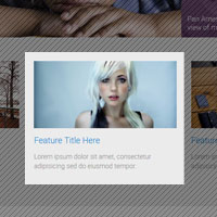
<figure class="figure--left">
<img src="200x200.png"  alt="describes image">
<figcaption>Caption describing image</figcaption>
</figure>
<p>Lorem ipsum dolor sit amet...</p>Lorem ipsum dolor sit amet, consectetur adipisicing elit, sed do eiusmod tempor incididunt ut labore et dolore magna aliqua. Ut enim ad minim veniam, quis nostrud exercitation ullamco laboris nisi ut aliquip ex ea commodo consequat. Duis aute irure dolor in reprehenderit in voluptate velit esse cillum dolore eu fugiat nulla pariatur. Excepteur sint occaecat cupidatat non proident, sunt in culpa qui officia deserunt mollit anim id est laborum.
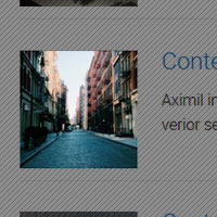
<figure class="figure--right">
<img src="200x200.png"  alt="describes image">
<figcaption>Caption describing image</figcaption>
</figure>
<p>Lorem ipsum dolor sit amet...</p><figure class="figure--sm">
<img src="200x200.png" alt="describes image">
<figcaption>Caption describing image</figcaption>
</figure>
Videos
Placement & Use
Videos should always be placed within the "figure" element for responsive sizing.
<figure class="video">
<!--embed code for youtube, vimeo, etc-->
<iframe width="420" height="315" src="//www.youtube.com/embed/0Bmhjf0rKe8" frameborder="0" allowfullscreen></iframe>
</figure>Media header
Aximil inulluptibus si officiatur aut accus ad essit as volesci aeprat verior seqvenes comn imp orecat landuciliti.
<div class="mediaBlock">
<figure class="video">
<iframe src="//www.youtube.com/embed/0Bmhjf0rKe8" frameborder="0" allowfullscreen></iframe>
</figure>
<div class="mediaBlock-body">
<h3 class="h4 brand-dark-blue">Media header</h3>
<p>Aximil inulluptibus si...</p>
<p><a class="btn" href="">Learn more</a></p>
</div>
</div>Media header
Aximil inulluptibus si officiatur aut accus ad essit as volesci aeprat verior seqvenes comn imp orecat landuciliti.
<div class="mediaBlock mediaBlock--right">
<figure class="video">
<iframe src="//www.youtube.com/embed/0Bmhjf0rKe8" frameborder="0" allowfullscreen></iframe>
</figure>
<div class="mediaBlock-body">
<h3 class="h4 brand-dark-blue">Media header</h3>
<p>Aximil inulluptibus si...</p>
<p><a class="btn" href="">Learn more</a></p>
</div>
</div>
Icons
A custom, font-based icon library has been created for your site using fontello.com. Icons can be applied directly to text elements like headings, paragraphs and links or they can also be applied inline pretty much wherever you would like.
You can add icons, edit existing ones or create custom ones at fontello.com. Instructions for using the font library can be found here.
ADA Compliance
Icons must exist as separate elements with aria-hidden set to true. This tells screen readers to ignore the element vs. trying to read it.
<a href="javascript:void(0)">Text Link <i class="icon-right-open" aria-hidden="true"></i></a>Icons can only be applied one way in order to be ADA Compliant:
<a href="javascript:void(0)">Text Link <i class="icon-right-open" aria-hidden="true"></i></a>Using the <i> method, icons can be animated and/or styled apart from their containing text element. They will also be ignored by screenreaders.
Loading...
<p><i class="icon-loading animate-spin" aria-hidden="true"></i> Loading...</p>Completed
<p><i class="icon-check h-colorGreen" aria-hidden="true"e;></i> Completed</p>Available icons/classes
Islands/Islets
Adds spacing of content with optional color styles
/* island *
/<div class="island">...</div>
/* islet */
<div class="islet">...</div>/* island *
/<div class="island island--grey">...</div>
/* islet */
<div class="islet islet--grey">...</div>/* island *
/<div class="island island--border">...</div>
/* islet */
<div class="islet islet--border">...</div>/* island *
/<div class="island island--border island--border--orange">...</div>
/* islet */
<div class="islet islet--border islet--border--orange">...</div>/* island *
/<div class="island island--border island--border--blue">...</div>
/* islet */
<div class="islet islet--border islet--border--blue">...</div>/* island *
/<div class="island island--orange">...</div>
/* islet */
<div class="islet islet--orange">...</div>/* island *
/<div class="island island--blue">...</div>
/* islet */
<div class="islet islet--blue">...</div>Cards
Cards build upon either the island or islet classes. Just make sure all the interior elements have the proper class name (island or islet).
/* Using island */
<div class="island island--card">
<div class="island--card-label icon-feather">Recent Blog Posts</div>
/* island--card-topLink is optional */
<a href="" class="island--card-topLink">APA blog <i class="icon-right-open"></i></a>
<p>Content here...</p>
</div>

/* Using islet */
<div class="islet islet--card">
<div class="islet--card-label icon-feather">Recent Blog Posts</div>
/* islet--card-topLink is optional */
<a href="" class="islet--card-topLink">APA blog <i class="icon-right-open"></i></a>
<p>Content here...</p>
</div>
/* Using island */
<div class="island island--card island--card--accent1">
<div class="island--card-label icon-feather">Recent Blog Posts</div>
/* island--card-topLink is optional */
<a href="" class="island--card-topLink">APA blog <i class="icon-right-open"></i></a>
<p>Content here...</p>
</div>

/* Using islet */
<div class="islet islet--card islet--card--accent1">
<div class="islet--card-label icon-feather">Recent Blog Posts</div>
/* islet--card-topLink is optional */
<a href="" class="islet--card-topLink">APA blog <i class="icon-right-open"></i></a>
<p>Content here...</p>
</div>
/* Using island */
<div class="island island--card island--card--accent2">
<div class="island--card-label icon-feather">Recent Blog Posts</div>
/* island--card-topLink is optional */
<a href="" class="island--card-topLink">APA blog <i class="icon-right-open"></i></a>
<p>Content here...</p>
</div>

/* Using islet */
<div class="islet islet--card islet--card--accent2">
<div class="islet--card-label icon-feather">Recent Blog Posts</div>
/* islet--card-topLink is optional */
<a href="" class="islet--card-topLink">APA blog <i class="icon-right-open"></i></a>
<p>Content here...</p>
</div>
/* Using island */
<div class="island island--card island--card--accent3">
<div class="island--card-label icon-feather">Recent Blog Posts</div>
/* island--card-topLink is optional */
<a href="" class="island--card-topLink">APA blog <i class="icon-right-open"></i></a>
<p>Content here...</p>
</div>

/* Using islet */
<div class="islet islet--card islet--card--accent3">
<div class="islet--card-label icon-feather">Recent Blog Posts</div>
/* islet--card-topLink is optional */
<a href="" class="islet--card-topLink">APA blog <i class="icon-right-open"></i></a>
<p>Content here...</p>
</div>
/* Using island */
<div class="island island--card island--card--accent4">
<div class="island--card-label icon-feather">Recent Blog Posts</div>
/* island--card-topLink is optional */
<a href="" class="island--card-topLink">APA blog <i class="icon-right-open"></i></a>
<p>Content here...</p>
</div>

/* Using islet */
<div class="islet islet--card islet--card--accent4">
<div class="islet--card-label icon-feather">Recent Blog Posts</div>
/* islet--card-topLink is optional */
<a href="" class="islet--card-topLink">APA blog <i class="icon-right-open"></i></a>
<p>Content here...</p>
</div>
/* Using island */
<div class="island island--card island--card--accent5">
<div class="island--card-label icon-feather">Recent Blog Posts</div>
/* island--card-topLink is optional */
<a href="" class="island--card-topLink">APA blog <i class="icon-right-open"></i></a>
<p>Content here...</p>
</div>

/* Using islet */
<div class="islet islet--card islet--card--accent5">
<div class="islet--card-label icon-feather">Recent Blog Posts</div>
/* islet--card-topLink is optional */
<a href="" class="islet--card-topLink">APA blog <i class="icon-right-open"></i></a>
<p>Content here...</p>
</div>
/* Using island */
<div class="island island--card island--card--accent6">
<div class="island--card-label icon-feather">Recent Blog Posts</div>
/* island--card-topLink is optional */
<a href="" class="island--card-topLink">APA blog <i class="icon-right-open"></i></a>
<p>Content here...</p>
</div>

/* Using islet */
<div class="islet islet--card islet--card--accent6">
<div class="islet--card-label icon-feather">Recent Blog Posts</div>
/* islet--card-topLink is optional */
<a href="" class="islet--card-topLink">APA blog <i class="icon-right-open"></i></a>
<p>Content here...</p>
</div>
/* Using island */
<div class="island island--card island--card--accent7">
<div class="island--card-label icon-feather">Recent Blog Posts</div>
/* island--card-topLink is optional */
<a href="" class="island--card-topLink">APA blog <i class="icon-right-open"></i></a>
<p>Content here...</p>
</div>

/* Using islet */
<div class="islet islet--card islet--card--accent7">
<div class="islet--card-label icon-feather">Recent Blog Posts</div>
/* islet--card-topLink is optional */
<a href="" class="islet--card-topLink">APA blog <i class="icon-right-open"></i></a>
<p>Content here...</p>
</div>
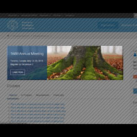
Feature Banner
Intended only for use in main content area of multi-column pages with a max-width of 850px
<div class="featureBanner">
<img src="http://placeimg.com/855/255/nature">
<div class="featureBanner-copy">
<h2>168thAnnual Meeting</h2>
<p>Toronto, Canada, May 16-20, 2015<br/>
Register by December 2</p>
<p><a href="" class="btn btn--white">Learn More</a></p>
</div>
</div>
Breadcrumbs
<ul class="breadCrumbs" role="navigation">
<li><a href=""></a></li>
<li><a href="">Two pages above this</a></li>
<li><a href="">One page above this</a></li>
<p>Content here...</p>
</ul>
Flyouts
<div class="flyout icon-attention">
<ul class="flyout-content">
<li><a href="...">Link/selection</a></li>
<li><a href="...">Link/selection</a></li>
</ul>
</div>

<div class="flyout icon-attention"> Uh-oh
<div class="flyout-content">
<h4>Attention needed</h4>
<p>please modify your profile <a href="...">settings</a></p>
</div>
</div><div class="flyout icon-attention h-floatRight">
<span class="bug">3</span>
<ul class="flyout-content flyout-content--left">
<li><a href="...">Link/selection</a></li>
<li><a href="...">Link/selection</a></li>
</ul>
</div><div class="flyout flyout--select"> <span>Sort: Relevance</span>
<ul class="flyout-content">
<li><a href="javascript:void(0)">Relevance</a></li>
<li><a href="javascript:void(0)">A-Z</a></li>
<li><a href="javascript:void(0)">Modified date</a></li>
</ul>
</div>Pagination
<ul class="pagination">
<li class="pagination-prev is-disabled"><a href="javascript:void(0)"></a></li>
<li class="pagination-current"><a href="javascript:void(0)">1</a></li>
<li><a href="javascript:void(0)">2</a></li>
<li><a href="javascript:void(0)">3</a></li>
<li><a href="javascript:void(0)">4</a></li>
<li><a href="javascript:void(0)">5</a></li>
<li class="pagination-next"><a href="javascript:void(0)"></a></li>
</ul>
Custom Forms
Textual form elements are set to be flexible and expand to 100% of their container to facilitate layout with the responsive grid system.
<fieldset>
<legend>User Settings</legend>
<div class="row">
<div class="column med-12">
<label for="fieldOne">First Name</label>
<input id="fieldOne" type="text" placeholder="First name please">
</div>
<div class="column med-12">
<label for="fieldTwo">Last Name</label>
<input id="fieldTwo" type="text" placeholder="Last name please">
</div>
</div>
<label for="fieldThree">Email</label>
<input id="fieldThree" type="email" placeholder="Enter email address">
<fieldset>
<legend class="legend--labelStyle">Send me</legend>
<div class="formCheckBox">
<span>
<input type="checkbox" id="checkOne">
<label for="checkOne">Offers</label>
</span>
<span>
<input type="checkbox" id="checkTwo">
<label for="checkTwo">Updates</label>
</span>
</div>
</fieldset>
<fieldset>
<legend class="legend--labelStyle">Every</legend>
<div class="formRadioButton">
<span>
<input name="radios" type="radio">
<label>Week</label>
</span>
<span>
<input type="radio" name="radios">
<label>Month</label>
</span>
</div>
</fieldset>
</fieldset>
<div class="formSubmit">
<a href="#" class="button
 disabled">Disabled</a>
<a href="#" class="button
 secondary">Cancel</a>
<a href="#" class="button
 primary">Submit</a>
</div>
"Labels" for checkboxes and radio button groups should be a legend element. Both should be wrapped in a fieldset.
<fieldset>
<legend class="legend--labelStyle">Checkboxes</legend>
<div class="formCheckBox">
<span>
<input type="checkbox" id="checkOne">
<label for="checkOne">Option1</label>
</span>
<span>
<input type="checkbox" id="checkTwo">
<label for="checkTwo">Option2</label>
</span>
<span>
<input type="checkbox" id="checkThree" >
<label for="checkThree">Option3</label>
</span>
</div>
</fieldset><fieldset>
<legend class="legend--labelStyle">Radio Buttons</legend>
<div class="formRadioButton">
<span>
<input type="radio" name="radios" id="radioOne" checked="">
<label for="radioOne">Option1</label>
</span>
<span>
<input type="radio" name="radios" id="radioTwo">
<label for="radioTwo">Option2</label>
</span>
<span>
<input type="radio" name="radios" id="radioThree">
<label for="radioThree">Option3</label>
</span>
</div>
</fieldset>Sections
This code snippet is used with free-form text containers, primarily within the Full-Width template. Sections are used to add spacing and control background images or colors applied as full-bleed. An inner div container sets the content to a max-width (the same as website's wrapper).
- If section and contained are not used together on T2A, the content will be full-width of the browser, that is to say, wider than the site's main content on all other templates.
- Section and contained can be used independently of one another in order to have wider content or contained elements.
- Applied images will be placed as backgrounds, centered and covering its respective container. Cropping is based on the content it holds so will not show the entire image. If the full image should be seen, an inline image should be used instead.
- Examples below are contained within Style Guide wrapper so are not full-width. Please see T2A for full-bleed appearance
<div class="section">
  <div class="contained">
    This is where your text content or code snippets will go.
  </div>
</div>This is a section, with background color primary applied within a contained div. See all Fill Color options under Helper Classes.
Note: this section appears contained in the Style Guide, see T2A for full-bleed appearance.
<div class="section h-fillColorPrimary h-colorWhite">
  <div class="contained">
   ..content..
  </div>
</div>This is a section, with background image applied within a contained div.
The inner content has additional helper classes applied to create a pseudo-banner effect. The height of the banner is dictacted by the wrapping content. A max-width is set to create a banner effect and will also enlarge the height on larger screens (due to forced wrapping).
<div class="section" style="background-image:url(URL HERE);">
  <div class="contained">
    <div class="island h-fillWhite60 h-displayInlineBlock" style="max-width:600px;margin:0 0 0 auto">
     ...content...
    </div>
  </div>
</div>
iAPPS Formbuilder Forms
By default, iAPPS places form elements in a container with the class of "formRow". By adding additional classes to this container, you can place multiple form elements side-by-side by controlling their widths across multiple screen resolutions. This is similar to the way the grid works except that there is no containing "row" div.
- Class names for controlling the widths of the form fields across various size devices are the same as the grid section
- Add classes to the "formRow" container, not the form element itself
- By necessity, form elements are slightly indented for responsive spacing
- At this time, only one class can be assigned each formRow div through iAPPS
- For grid purposes, the columns in each row of form elements should equal 24 (see grid section).
Naming Convention
This site uses a modified version of the BEM naming syntax. The modified version used is based largely on Nicolas Gallagher's extended BEM syntax. The intention is to make the styles more readable and understandable for humans.
Note though that class names composed of two or more words are written in camelCase as opposed to Gallagher's PascalCase.
/* Component */
.componentName {}

/* Component modifier */
.componentName--modifierName {}

/* Component descendant */
.componentName-descendant {}

/* Component descendant modifier */
.componentName-descendant--modifierName {}

/* Component state (scoped to component) */
.componentName.is-stateOfComponent {}
Begin class names with the most abstract descriptor and then layer in specifics.
/* Basic nav style */
.nav {}

/* The main nav of the site */
.navMain {}

/* The secondary nav of the site */
.navSecondary {}

/* The footer nav */
.navFooter {}
Class names should be reusable and descriptive. We use the multi-class pattern where by laying class names onto an element we can achieve many different and reusable styles.
.btn { /* basic button styles */ }
.btn--primary { /* styles specific to primary button */ }

<button class="btn">Default</button>
<button class="btn btn--primary">Login</button>
Use .is-stateName to reflect changes to a component's state. The state name must be camel case. Never style these classes directly; they should always be used as an adjoining class.
This means that the same state names can be used in multiple contexts, but every component must define its own styles for the state (as they are scoped to the component).
.tweet { /* ... */ }
.tweet.is-expanded { /* ... */ }

<article class="tweet is-expanded">...</article>
Grid
For maximum layout flexibility, this site has been built using a responsive, nestable, 24 column Flexbox grid.
You can adjust column width across various screen widths:
- xsm - Small smartphones
- sm - Larger smartphones and small tablets
- med - Tablets and small desktop monitors
- lg - Large tablets and desktop monitors
- xlg - Desktop monitors and smartTVs
- xxlg - Large desktop monitors and smartTVs
The grid is mobile-first so think of each "column" as naturally being 100% wide and you will be adjusting that width as the screen gets larger.
Basic usage
Place a div on the page with the class of "row". This will hold your columns.
<div class="row"></div>Add your column divs with the class "column" applied to each one.
<div class="row">
<div class="column"></div>
...
<div>
Add classes to the column divs to determine how many of the available 24 columns they will occupy and at what screen size the width should be applied to the column.
<div clas="row">
<div class="column med-12"></div>
...
<div>
Column Widths
- Remember the grid is mobile first, so you are applying widths as the screen gets larger. A column with med-12 applied, will take up 12 columns on medium and large screens also.
<div class="row">
<div class="column med-6"></div>
<div class="column med-18"></div>
</div><div class="row">
<div class="column xsm-12 sm-6 med-4 lg-2">...</div>
<div class="column xsm-12 sm-6 med-4 lg-2">...</div>
<div class="column xsm-12 sm-6 med-4 lg-2">...</div>
<div class="column xsm-12 sm-6 med-4 lg-2">...</div>
<div class="column xsm-12 sm-6 med-4 lg-2">...</div>
<div class="column xsm-12 sm-6 med-4 lg-2">...</div>
<div class="column xsm-12 sm-6 med-4 lg-2">...</div>
<div class="column xsm-12 sm-6 med-4 lg-2">...</div>
<div class="column xsm-12 sm-6 med-4 lg-2">...</div>
<div class="column xsm-12 sm-6 med-4 lg-2">...</div>
<div class="column xsm-12 sm-6 med-4 lg-2">...</div>
<div class="column xsm-12 sm-6 med-4 lg-2">...</div>
</div>
</div>Column Offsets
Columns can be offset by column widths at any of the pre-determined breakpoints
<!-- Format for these modifier classes are "offset", media query, then the number of columns you would like to offset at that breakpoint  -->
offset-[xsm|sm|med|lg|xlg|xxlg]-[1-23]
<div class="row">
<div class="column med-10"></div>
<div class="column med-10 offset-med-4"></div>
</div>
Column Centering
Columns can be centered at any of the pre-determined breakpoints
- This works only with a single column within a row OR if the proceeding column fills the entire 24 columns
<!-- Format for these modifier classes are "centered" and then the media query -->
centered-[xsm|sm|med|lg|xlg|xxlg]
<div class="row">
<div class="column med-12 centered-med"></div>
<div class="column med-24"></div>
</div>
Visual Source order change
Generally, columns will stack top to bottom at their natural 100% width and display left to right once we apply a column width. Since we have a grid based on Flexbox, the visual source order of the individual Columns can be changed by adding modifier classes to them.
- Apply the appropriate order modifier class to all columns within the parent div or unexpected results may occur.
- Keep in mind that the source order change is visual and not actual. So screen readers for the disabled will still read the content in the original source order (at this time).
<!-- Format for these modifier classes are "order", media query, then the position you would like the column to be in at that breakpoint  -->
order-[xsm|sm|med|lg|xlg|xxlg]-[1-23]
Second at med breakpoint,
Fourth at lg breakpoint
Fourth at med breakpoint,
Third at lg breakpoint
First at med breakpoint,
Second at lg breakpoint
Third at med breakpoint,
First at lg breakpoint
<div class="row">
<div class="column med-12 order-med-2 order-lg-4">...</div>
<div class="column med-12 order-med-4 order-lg-3">...</div>
<div class="column med-12 order-med-3 order-lg-2">...</div>
<div class="column med-12 order-med-1 order-lg-1">...</div>
<div>
Setting Vertical Alignment
Columns are set to have a vertical alignment of top.
<div class="row row--verticalCenter">
  <div class="column med-8">...</div>
  <div class="column med-8">...</div>
  <div class="column med-8">...</div>
<div><div class="row row--verticalEnd">
<div class="column med-8">...</div>
<div class="column med-8">...</div>
<div class="column med-8">...</div>
<div>Tabs
<ul class="tabs">
<li><a href="javascript:void(0)">Tab one</a>
<div>
<p>Content for tab one.</p>
</div>
</li>
<li><a href="javascript:void(0)">Tab two</a>
<div>
<p>Content for tab two.</p>
</div>
</li>
</ul><ul class="tabs tabs--accordion">
<li><a href="javascript:void(0)">Tab one</a>
<div>
<p>Content for tab one.</p>
</div>
</li>
<li><a href="javascript:void(0)">Tab two</a>
<div>
<p>Content for tab two.</p>
</div>
</li>
<li><a href="javascript:void(0)">Tab three</a>
<div>
<p>Content for tab three.</p>
</div>
</li>
<li><a href="javascript:void(0)">Tab four</a>
<div>
<p>Content for tab four.</p>
</div>
</li>
</ul>Toggle Links
There can be multiple hidden elements and their triggers on one page. The trigger will toggle the hidden div which follows it in the source code.
<a class="toggleLink">Show hidden content 1 on click</a>
<div class="toggleLinkTarget is-hidden">Hidden content 1</div><a class="toggleLink toggleLink--icons">Show hidden content 1 on click</a>
<div class="toggleLinkTarget is-hidden">Hidden content 1</div>Popups & Inline Popups
In-depth documentation, options and examples for the popup modals used on this site can be found here: http://dimsemenov.com/plugins/magnific-popup/documentation.html
With consideration to ADA Compliance: popups can be used and still achieve ADA Compliance, but it is suggested they are used minimally and not be initialized on page load.
Inline popup is fixed to the bottom of the page and is only closeable when clicking the button.
This is the best option for notices that must be initialized on page load (such as cookie or term agreements).
Optional Header for the Inline Popup will go here
Text for the notifiation goes here. Can link to other pages lorem ipsum dolor sit amet, consectetur adipiscing elit. Nulla vitae hendrerit justo. Fusce ut tellus quis sem auctor feugiat. Praesent iaculis blandit nulla, id accumsan justo suscipit quis. Donec leo neque, molestie in mauris sed, gravida congue arcu. Pellentesque at est id lectus tristique ultrices eu a sapien. Cras et orci vitae
<div class="popupInline popup--closeable">
  <div class="popupInline-content">
    <h1 class="popupInline-header">Optional for the Inline Popup will go here>
    <p>Text for the notifiation goes here. Can <a href="">link to other pages</a> lorem ipsum dolor sit amet, consectetur adipiscing elit. Nulla vitae hendrerit justo. Fusce ut tellus quis sem auctor feugiat. Praesent iaculis blandit nulla, id accumsan justo suscipit quis. Donec leo neque, molestie in mauris sed, gravida congue arcu. Pellentesque at est id lectus tristique ultrices eu a sapien. Cras et orci vitae</p>
  </div>
  <div class="popupInline-CTA">
    <a href="javascript:(void)" class="btn btn--secondary btn--lg popup-close">Close</a> <a href="">Another Option</a>
  </div>
</div><!--The link. data-mfp-src matches id of popup to open -->
<a data-mfp-src="#test-popup" class="openPopup">Show inline popup</a>
<!--the popup-->
<div id="test-popup" class="popup mfp-hide">
Popup content
</div><!--The link. HREF pointed to the image, popupType="image" -->
<a href="File Library/styleguide-files/200x200.png" class="openPopup" popupType="image">Show image popup</a><!--The link. HREF pointed to the YouTube or Vimeo URL, popupType="iframe" -->
<a href="https://www.youtube.com/watch?v=XQWOKBBJ114" class="openPopup" popupType="iframe">Show image popup</a><!--The link. HREF pointed to Google Maps URL (querystring format only!), popupType="iframe" -->
<a href="https://maps.google.com/maps?q=Gary+Lee's+Motor+Club+and+Grub" class="openPopup" popupType="iframe">Show Google Map popup</a>Q & A
Aximil inulluptibus si officiatur aut accus ad essit as volesci aeprat verior seqvenes comn imp orecat landuciliti?
<div class="qna">
<p class="qna-q">Question...</p>
<div class="qna-a">Answer...</div>
</div>
Searchbar
<div class="searchBar">
<div class="searchBar-filter"> <span>Search: Bookstore</span>
<ul class="searchBar-filter-content">
<li>
<input type="radio" name="radios" id="filter01" checked="">
<label for="filter01">Bookstore</label>
</li>
<li>
<input type="radio" name="radios" id="filter02">
<label for="filter02">PsychiatryOnline</label>
</li>
<li>
<input type="radio" name="radios" id="filter03">
<label for="filter03">Psychiatric News</label>
</li>
<li>
<input type="radio" name="radios" id="filter04">
<label for="filter04">American Journal of Psychiatry</label>
</li>
</ul>
</div>
<input type="search" class="searchBar-input" />
<button class="searchBar-submit"></button>
</div>
Searchbox
With consideration to ADA Compliance: all form fields must have associated label, even if the label is visually hidden. Make sure that the "for" attribute of all labels match the "id" of the form elements they are associated with.
<div class="searchBox">
<label for="searchBox1"> class="h-visuallyHidden">Label for Search Box 1 Visually Hidden</label>
<input type="text" id="searchBox1" name="" placeholder="search">
<a class="icon-search"></a></div><div class="searchBox searchBox--hiVis">
<label for="searchBox2"> class="h-visuallyHidden">Label for Search Box 1 Visually Hidden</label>
<input type="text" id="searchBox2" name="" placeholder="search">
<a class="icon-search"></a></div>Media Block
Place any image and text-like content side-by-side, as per: http://stubbornella.org/content/2010/06/25/the-media-object-saves-hundreds-of-lines-of-code
Basic usage is for images. For usage with videos see video section
Media header
Aximil inulluptibus si officiatur aut accus ad essit as volesci aeprat verior seqvenes comn imp orecat landuciliti.
<div class="mediaBlock">
<figure><img src="200x200.png"></figure>
<div class="mediaBlock-body">
<h3>Media header</h3>
<p>Aximil inulluptibus si officiatur aut accus ad essit as volesci aeprat verior seqvenes comn imp orecat landuciliti.</p>
<p><a href="" class="btn">Learn more</a></p>
</div>
</div>Media header
Aximil inulluptibus si officiatur aut accus ad essit as volesci aeprat verior seqvenes comn imp orecat landuciliti.
<div class="mediaBlock mediaBlock--right">
<figure><img src="200x200.png"></figure>
<div class="mediaBlock-body">
<h3>Media header</h3>
<p>Aximil inulluptibus si officiatur aut accus ad essit as volesci aeprat verior seqvenes comn imp orecat landuciliti.</p>
<p><a href="" class="btn">Learn more</a></p>
</div>
</div><div class="mediaBlock mediaBlock--feature">
<a href="...">
<figure><img src="200x200.png"></figure>
<div class="mediaBlock-body">
<h4><span>Media header</span></h4>
<p>Aximil inulluptibus si officiatur aut accus ad essit as volesci aeprat verior seqvenes.</p>
</div>
</a>
</div><div class="mediaBlock mediaBlock--feature mediaBlock--feature--purple">
<a href="...">
<figure><img src="200x200.png"></figure>
<div class="mediaBlock-body">
<h4><span>Media header</span></h4>
<p>Aximil inulluptibus si officiatur aut accus ad essit as volesci aeprat verior seqvenes.</p>
</div>
</a>
</div><div class="mediaBlock mediaBlock--feature mediaBlock--feature--orange">
<a href="...">
<figure><img src="200x200.png"></figure>
<div class="mediaBlock-body">
<h4><span>Media header</span></h4>
<p>Aximil inulluptibus si officiatur aut accus ad essit as volesci aeprat verior seqvenes.</p>
</div>
</a>
</div>66th Institute on Psychiatric Services
- Johnson-Smith Events Center
- Mon, Jan 26 - Wed, Dec 28
- 8am - 2pm
Aximil inulluptibus si officiatur aut accus ad essit as volesci aeprat verior seqvenes comn imp orecat landuciliti.
<div class="mediaBlock">
<figure class="figure--calendar">
<div class="calendar-detail">
<div class="calendar-detail-mo">JAN</div>
<div class="calendar-detail-yr">2015</div>
</div>
26
</figure>
<div class="mediaBlock-body">
<h5><a href="">66th Institute on Psychiatric Services</a></h5>
<ul class="list--info">
<li class="icon-location">Johnson-Smith Events Center</li>
<li class="icon-calendar">Mon, Jan 26 - Wed, Dec 28</li>
<li class="icon-clock">8am - 2pm</li>
</ul>
</div>
<p>Aximil inulluptibus si officiatur aut accus ad essit as volesci aeprat verior seqvenes comn imp orecat landuciliti.</p>
</div>
Downloads
Site Image Templates (PSD)
General Image - Rectangular
This is the template for the default rectangular images used across the site. Size can be modified, but has been optimized for most uses.
General Image - Square
This is the template for the default rectangular images used across the site. Size can be modified, but has been optimized for most uses.
Helper Classes
Helper classes are provided to accomodate one-off situations where additional CSS attributes need to be applied to an element for layout or presentation purposes.
Font-color Helper Classes
Colors text the basic red used to style the site
<p class="h-colorRed">..</p>Colors text the basic green used to style the site
<p class="h-colorGreen">..</p>Colors text the basic blue used to style the site
<p class="h-colorBlue">..</p>Colors text the basic yellow used to style the site
<p class="h-colorYellow">..</p>Colors text the basic grey used to style the site
<p class="h-colorGrey">..</p>Colors text the basic light grey used to style the site
<p class="h-colorGreyLight">..</p>Colors text the basic lighter grey used to style the site
<p class="h-colorGreyLighter">..</p>Colors text the basic lightest grey used to style the site
<p class="h-colorGreyLightest">..</p>Colors text white
<p class="h-colorWhite">..</p>Colors text black
<p class="h-colorBlack">..</p>Fill-color Helper Classes
Sets background color the primary blue from color palette.
<p class="h-fillColorPrimary h-colorWhite">..</p>Sets background color the secondary blue from color palette.
<p class="h-fillColorSecondary h-colorWhite">..</p>Sets background color the tertiary blue from color palette.
<p class="h-fillColorTertiary h-colorWhite">..</p>Sets background color the accent orange from color palette.
<p class="h-fillAccentOrange h-colorWhite">..</p>Sets background color the accent aqua from color palette.
<p class="h-fillAccentAqua h-colorWhite">..</p>Sets background color the accent purple from color palette.
<p class="h-fillAccentPurple h-colorWhite">..</p>Sets background color the accent teal from color palette.
<p class="h-fillAccentTeal h-colorWhite">..</p>Sets background color the accent green from color palette.
<p class="h-fillAccentGreen h-colorWhite">..</p>Sets background color the accent green light from color palette.
<p class="h-fillAccentGreenLight h-colorWhite">..</p>Sets background color the grey from color palette.
<p class="h-fillGrey h-colorWhite">..</p>Sets background color the grey light from color palette.
<p class="h-fillGreyLight">..</p>Sets background color the grey lighter from color palette.
<p class="h-fillGreyLighter">..</p>Sets background color the grey lightest from color palette.
<p class="h-fillGreyLightest">..</p>Sets background color to white.
<p class="h-fillWhite">..</p>Sets background color to white, 80% opacity for text overlays.
<p class="h-fillWhite80">..</p>Sets background color to white, 60% opacity for text overlays.
<p class="h-fillWhite60">..</p>Sets background color to white.
<p class="h-fillBlack h-colorWhite">..</p>Sets background color to white, 80% opacity for text overlays.
<p class="h-fillBlack80 h-colorWhite">..</p>Sets background color to white, 60% opacity for text overlays.
<p class="h-fillBlack60 h-colorWhite">..</p>Font Face Helper Classes
Style text elements in the same font-family used for headings and highlight text
<p class="h-fontHighlight">..</p>Style text elements in the same font-family as the main font used on the site.
<p class="h-fontBase">..</p>Font Size Helper Classes
H1 size text.
<p class="h-h1">..</p>H2 size text.
<p class="h-h2">..</p>H3 size text.
<p class="h-h3">..</p>H4 size text.
<p class="h-h4">..</p>H5 size text.
<p class="h-h5">..</p>H6 size text.
<p class="h-h6">..</p>XSm size text.
<p class="h-sizeXSm">..</p>Sm size text.
<p class="h-sizeSm">..</p>Lg size text.
<p class="h-sizeLg">..</p>XLg size text.
<p class="h-sizeXLg">..</p>Alignment Helper Classes
Aligns text left.
<p class="h-textLeft">..</p>Aligns text center.
<p class="h-textCenter">..</p>Aligns text right.
<p class="h-textRight">..</p>Margin Helper Classes
Adds base spacing margin all around.
<p class="h-push">..</p>Adds base spacing margin to top.
<p class="h-pushTop">..</p>Adds base spacing margin to right.
<p class="h-pushRight">..</p>Adds base spacing margin to bottom.
<p class="h-pushBottom">..</p>Adds base spacing margin to left.
<p class="h-pushLeft">..</p>Adds base spacing margin to top and bottom.
<p class="h-pushEnds">..</p>Adds base spacing margin to right and left.
<p class="h-pushSides">..</p>Adds small spacing margin all around.
<p class="h-pushHalf">..</p>Adds small spacing margin to top.
<p class="h-pushHalfTop">..</p>Adds small spacing margin to right.
<p class="h-pushHalfRight">..</p>Adds small spacing margin to bottom.
<p class="h-pushHalfBottom">..</p>Adds small spacing margin to left.
<p class="h-pushHalfLeft">..</p>Adds small spacing margin to top and bottom.
<p class="h-pushHalfEnds">..</p>Adds small spacing margin to right and left.
<p class="h-pushHalfSides">..</p>Adds large spacing margin all around.
<p class="h-pushDouble">..</p>Adds large spacing margin to top.
<p class="h-pushDoubleTop">..</p>Adds large spacing margin to right.
<p class="h-pushDoubleRight">..</p>Adds large spacing margin to bottom.
<p class="h-pushDoubleBottom">..</p>Adds large spacing margin to left.
<p class="h-pushDoubleLeft">..</p>Adds large spacing margin to top and bottom.
<p class="h-pushDoubleEnds">..</p>Adds large spacing margin to right and left.
<p class="h-pushDoubleSides">..</p>Removes margin all around.
<p class="h-flush">..</p>Removes margin top.
<p class="h-flushTop">..</p>Removes margin right.
<p class="h-flushRight">..</p>Removes margin bottom.
<p class="h-flushBottom">..</p>Removes margin left.
<p class="h-flushLeft">..</p>Padding Helper Classes
Adds base spacing padding all around.
<p class="h-soft">..</p>Adds base spacing padding to top.
<p class="h-softTop">..</p>Adds base spacing padding to right.
<p class="h-softRight">..</p>Adds base spacing padding to bottom.
<p class="h-softBottom">..</p>Adds base spacing padding to left.
<p class="h-softLeft">..</p>Adds base spacing padding to top and bottom.
<p class="h-softEnds">..</p>Adds base spacing padding to right and left.
<p class="h-softSides">..</p>Adds small spacing padding all around.
<p class="h-softHalf">..</p>Adds small spacing padding to top.
<p class="h-softHalfTop">..</p>Adds small spacing padding to right.
<p class="h-softHalfRight">..</p>Adds small spacing padding to bottom.
<p class="h-softHalfBottom">..</p>Adds small spacing padding to left.
<p class="h-softHalfLeft">..</p>Adds small spacing padding to top and bottom.
<p class="h-softHalfEnds">..</p>Adds small spacing padding to right and left.
<p class="h-softHalfSides">..</p>Adds large spacing padding all around.
<p class="h-softDouble">..</p>Adds large spacing padding to top.
<p class="h-softDoubleTop">..</p>Adds large spacing padding to right.
<p class="h-softDoubleRight">..</p>Adds large spacing padding to bottom.
<p class="h-softDoubleBottom">..</p>Adds large spacing padding to left.
<p class="h-softDoubleLeft">..</p>Adds large spacing padding to top and bottom.
<p class="h-softDoubleEnds">..</p>Adds large spacing padding to right and left.
<p class="h-softDoubleSides">..</p>Removes padding all around.
<p class="h-hard">..</p>Removes padding top.
<p class="h-hardTop">..</p>Removes padding right.
<p class="h-hardRight">..</p>Removes padding bottom.
<p class="h-hardBottom">..</p>Removes padding left.
<p class="h-hardLeft">..</p>Float Helper Classes
Apply to items containing floated elements so the inner elements will not escape the boundaries of their container.
<p class="h-clearfix">..</p>Apply to items to clear both left and right floats.
<p class="h-clearBoth">..</p>Apply to items to clear right floats.
<p class="h-clearRight">..</p>Apply to items to clear left floats.
<p class="h-clearLeft">..</p>Floats items to the right.
<p class="h-floatRight">..</p>Floats items to the left.
<p class="h-floatLeft">..</p>Removes any floats.
<p class="h-floatNone">..</p>Misc Helper Classes
<a class="h-disabled">..</p><a class="h-muted">..</p>Hides an element visually but leaves it accessible to screen readers. Useful for 508 compliance.
<a class="h-visuallyHidden">..</p>Applies bottom border to an element.
<p class="h-underline">..</p>Applies top border to an element.
<p class="h-overline">..</p>Strikes text in the element.
<p class="h-strikethrough">..</p>Displays text in caps.
<p class="h-caps">..</p>Truncates runs of text with a fade (removes line wrapping as well). Lorem ipsum dolor sit amet, consectetur adipiscing elit, sed do eiusmod tempor incididunt ut labore et dolore magna aliqua. Ut enim ad minim veniam, quis nostrud exercitation ullamco laboris nisi ut aliquip ex ea commodo consequat.
<p class="h-truncate">..</p>Takes a block-line element (such as a paragraph, and displays as inline-block. Such things as "max-widths" can be added to create simple banners.
<p class="h-displayInlineBlock">..</p>General Coding Notes
- When adding images to the site, do not include width and height in the HTML for the image. Use the appropriate image template provided and the CSS should scale the image automatically.
- iAPPS and this site are designed for you to have great flexibility in adding content such as copy and images. Adding new structural elements should be done by a front end developer familiar with responsive design best practices or the site layout may break.
- If you decide to add HTML elements such as tables, divs or spans, avoid using pixel based widths and use percentages if you must add widths. The site scales content in percentages as it expands and contracts so pixel widths will break the layout.
- As a general rule, after adding content, resize the browser from small to large widths and if possible, view on different devices to ensure added content does not break the layout of the site and looks attractive.
- Do not use Flash content on the site as many mobile devices do not support it.
ADA Compliance
Title II of the ADA outlines nondiscrimination requirements for website accessibility, strictly enforced for state and local government websites. However, such recommendations are strongly suggested for application on all websites in an effort to follow ADA best practices for accessibility.
REQUIREMENTS
Under ADA’s Web Accessibility Practices & Web Content Accessibility Guidelines
- Forms & tables must properly label each control – for forms, this includes: buttons, checkboxes, dropdowns, text fields, etc. Include any special instructions within field labels and ensure logical order of input data. When using tables, ensure the correct column and row headers are identified with appropriate tags (such as < th> for table headers). All tags and form elements must have text values.
- Images, videos, audio etc. must have text equivalents & alt tags - in some cases, these will be long and descriptive. All descriptions should include the purpose of the object(s). If the image is linked, it should describe the graphic as well as the link destination. Any graphics used purely for decoration should not have an alt tag (use empty alt description, alt=""). Provide detailed descriptions of video and audio content. Try to avoid embedded videos; if used, also create a link to the video. Any posted documents must be in text-based formats (HTML, PDF).
- Navigation & keyboard accessibility –all functionality (video, audio, & other multimedia) must be available from a keyboard without requiring specific timings. It is best to include ‘Skip Navigation’ link to allow user to skip to content, which provides easier and faster navigation across multiple pages.
- Minimize blinking, flashing & any other strobe effects– consider removing auto-rotation of sliders, carousels and other moving elements. Instead, have users initiate animation/motion. Limit the use of popups, especially those preventing users from initial interaction on site. Ensure popups have compliant controls.
- AA color contrast requirements - your link color has to be significantly different from the background color AND the surrounding text color, which also has to be significantly different from the background color.
- 4.5:1 contrast between the non-link text color and the background.
- A 4.5:1 contrast between the link text color and the background.
- A 3:1 contrast between the link text color and the surrounding non-link text color.
CONSIDERATIONS
The following is an overarching list of issues found continuously across the APA site. These items should be reviewed on a global level to ensure the best experience for ADA users.
- Check header usages – using proper
tags to avoid screen readers confusing false headers with real ones. Do not list any empty header tags, delete them. Headers are considered one of the most important elements in identifying and navigating content. - Do not skip heading levels – it’s important to follow a cohesive outline with your content, since keyboard and screen readers navigate by heading elements. Avoid skipping heading levels by setting appropriate hierarchy structure (H1, H2, H3, H4 etc.). Consider that there are many pages wherein < h1> is not followed by any other content, resulting in next heading level to be < h5> in footer.
- Check images for detailed alt tag text – while a critical error is classified as a missing alt tag, just as important is an empty alt tag. Empty alt tags should be established and only used for purely decorative graphics – all other images lending to content must have a detailed text alternative.
- Ex: “Picture of a computer.”
- “Image of a closed laptop computer on a blue table with coffee cup.”
- Avoid using redundant title text – in most cases the title attribute can be removed, otherwise modify it to provide advisory, but not redundant information. Note that the title text may or may not be read by a screen reader and is typically inaccessible to sighted keyboard users. The advisory information presented should not be identical to or very similar to the element text or alternative text.
- Avoid using redundant links (adjacent links to same URL) – results in additional navigation and repetition for keyboard and screen reader users. Combine these links when possible.
- Avoid low contrast between foreground & background colors – adequate contrast is necessary for all users, especially users with low vision. Increase the contrast between the foreground (text) color and the background color. Large text (larger than 18 point or 14 point bold) does not require as much contrast as smaller text. contrast color checker
Basic Checklist
- Does the page title clearly and succinctly describe the page content?
- Are heading elements used to convey logical hierarchy and denote the beginning of each section of content?
- Are headings used in correct chronological order so as to give a proper outline of the page content?
- Are buttons and links clearly and logically named? Are repetitive & redundant links avoided?
- Is underlined text used for no other purpose other than to identify links & URLs?
- Do images have equivalent alternative text specified in the alt attribute of the img element?
- Does the alternate text convey contextual relevance to the page it is on?
- Does text content contained in images disappear when images are not available, i.e. is there text contained in the images? If yes, is this text equally represented on the page & in alt tag?
- Is information conveyed by color also conveyed by context, markup, graphic coding, or other means? i.e. color is not the only distinguishable characteristic for important data
Technical Application Checklist
- For tables containing data, do th elements appropriately define every row and/or every column headers?
- Does the page NOT contain the marquee and blink elements?
- Is placeholder text, if used, NOT redundant or distracting to users of assistive technology?
- Does each frame and iframe element have a meaningful title attribute?
- Is a full text transcript provided for any prerecorded audio and video?
- If using any form elements, does each appropriate input element or form control have an associated and visible label element or title attribute?
Sass
SASS has been used in the building of this site for ease of maintenance, organization and best practices. The compiled CSS files themselves should not be edited directly or the benefits of using SASS on your site will be lost. Instead, a SASS compatible compiler such as Compass or Scout should be used by a front end developer familiar with SASS and CSS compilers.
If additional non-SASS CSS must be added to the site, it is recommended that additional style sheets be created instead and included in the page.